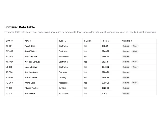
Data Table 2 block design & features
DataTable2 is a left-aligned section with a heading, description, and a full-width data table below. The table displays six columns: SKU, item name, type, stock status, price, and availability badges. Sortable column headers include toggle buttons with directional arrows. The table contains ten rows of product inventory data.
Light background with dark text. The table has a rounded outer border with visible borders between every cell, both horizontally and vertically. This creates a grid-like appearance where each cell is clearly separated from its neighbors. Column headers use ghost-style buttons that show sort direction icons on interaction. Price values are formatted as currency. Availability displays as secondary badges, sometimes two per row. Compact row height with consistent cell padding. Static layout with no entrance animations.
This is a basic, functional data table with a shadcn-default appearance and one notable twist: the full grid border treatment. The visible vertical and horizontal cell borders give it a more traditional spreadsheet look compared to the borderless row style common in modern tables. A straightforward implementation that prioritizes clarity and cell separation over visual minimalism.