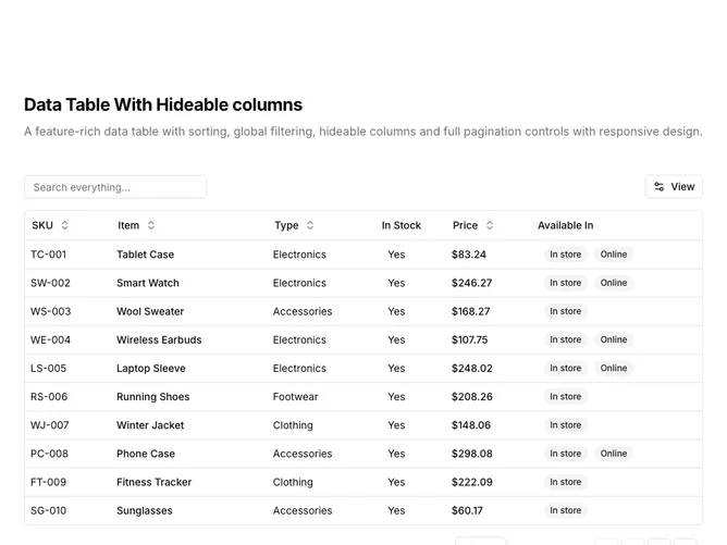
Data Table 10 block design & features
DataTable10 is a left-aligned section with a heading, description, a toolbar with global search and a View dropdown, and a full-width data table with pagination controls below. The toolbar contains a text input for global search and a "View" button that opens a dropdown menu for toggling column visibility. The table displays six columns: SKU, item name, type, stock status, price, and availability badges. Sortable column headers include toggle buttons with directional arrows. The table contains fifteen rows of product inventory data. Full pagination controls appear below.
Light background with dark text. The table has a thin rounded border. The toolbar shows the search input on the left and the View dropdown on the right. The View dropdown uses checkboxes to show/hide columns, with a badge indicating how many columns are hidden and a Reset button to restore defaults. Column headers use ghost-style buttons that show sort direction icons on interaction. Price values are formatted as currency. Availability displays as secondary badges. The pagination area includes row count, page size dropdown, page indicator, and navigation buttons. Static layout with no entrance animations.
This is a customizable data table with column visibility controls. Users can hide columns they do not need, reducing visual clutter for wide tables. Combined with global search and full pagination, it provides a flexible interface for exploring datasets where not all columns are relevant to every user.