Cta 5 block design & features
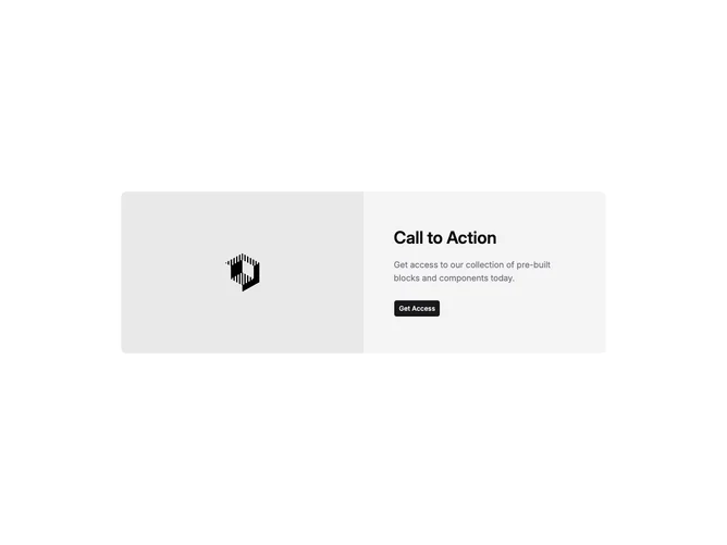
Cta5 is a split call-to-action built with shadcn/ui inside a full-width section. On large screens the layout is two columns inside one rounded container: one half is a landscape image with rounded corners that meet the panel edge, the other half stacks a level-three heading, a muted foreground paragraph, and a single Button wrapped as an anchor. The outer section uses vertical padding and a centered max width container.
The inner surface is a muted background with a sharper radius on medium viewports and up. The image uses a fixed aspect and object-cover so the photo reads as a hero slice beside the copy. Typography steps up from mobile to desktop for the heading, with comfortable spacing before the action.
Overall this reads as a restrained marketing pattern: one image, one message, one click. It is simpler than multi-button or form CTAs because props drive only heading, description, image, and the primary button link.
The row flips from stacked image-over-copy to side-by-side at the large breakpoint. Padding tightens on small screens and opens on larger ones so the text column stays airy next to the photo.