Cta 4 block design & features
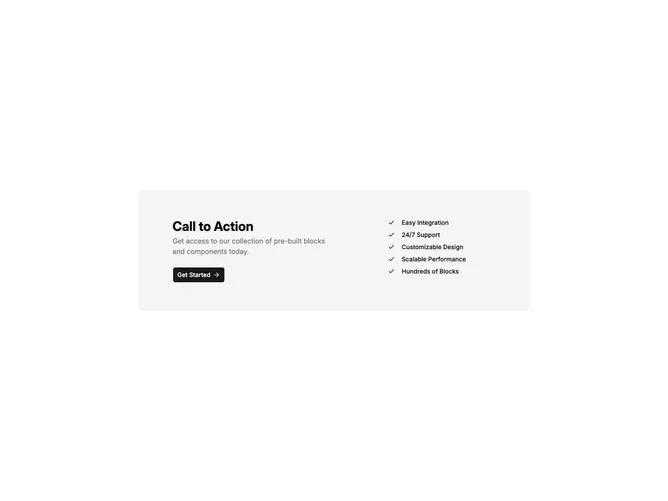
This block places a single rounded card on a muted background inside a centered container, built with Shadcn UI for the primary action control. The card splits into two columns from the medium breakpoint: roughly half width for a bold heading, paragraph, and button with a trailing arrow icon, and a narrower third for a vertical list of feature strings. Section padding is generous vertically and the card gets extra horizontal padding on large screens.
Color stays within neutral system tokens: the card uses the muted surface, body copy is muted foreground, and the button follows default primary treatment. List rows are small dense type with icon leading each line. The layout is static with no carousel or media.
Complexity is moderate mainly because of the feature list: you need several short bullet-style strings in addition to headline, description, and one primary URL. The pattern is a common marketing pairing of pitch plus proof points rather than a single slogan and dual buttons.
On small screens the checklist moves below the text stack so the narrative reads before the enumerations.