Cta 13 block design & features
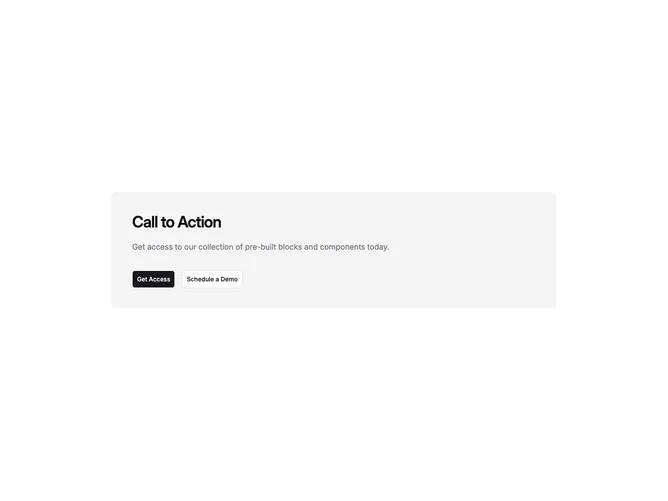
Cta13 is a dual-action CTA band built with shadcn/ui inside a rounded accent container with generous vertical padding. Heading and supporting copy align to the start of the column, followed by a primary and optional outline secondary button row that starts stacked and relaxes into a horizontal pair on wider breakpoints.
Surface treatment matches the simple CTA family: tinted accent background, subdued body color, large title tracking, and full-width buttons on phones. The left alignment differentiates it from centered variants that put the whole story in the middle of the card; here text reads like a banner anchored to one edge of the content box.
The result is a standard marketing strip with minimal ornament and a clear binary choice. Uniqueness is mostly alignment rhythm versus centered alternatives, not extra widgets. You plug in title, description, and up to two destinations; behavior stays straightforward.
Expect the same max-width card centered in the section so long headlines still wrap in a predictable measure on large displays.