
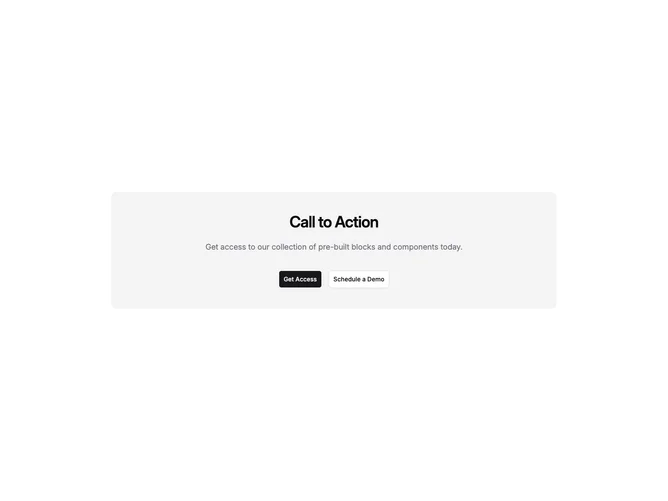
Cta 12 block design & features
Cta12 is a centered call-to-action band built with Shadcn UI: heading and body text sit in a single centered column above a button group, all inside a rounded accent surface with generous vertical padding. Unlike split layouts that park buttons beside copy on desktop, this pattern keeps the narrative and actions in one vertical rhythm for a classic full-width strip.
The accent fill carries most of the visual weight, with muted foreground on the description and standard filled and outline buttons for the two outcomes. Motion is static; emphasis comes from size jumps between title levels and comfortable spacing in the padded container. The max-width constraint keeps line length tight so the block does not feel like edge-to-edge text.
It reads as a focused conversion moment meant to interrupt a scroll with a single decision. Compared with side-by-side CTA bands, the centered stack reads more like a modal or card without a dialog. Complexity stays low: supply strings and URLs for up to two links. The block fits mid-page promos where symmetry matters more than horizontal efficiency.
Small screens stack buttons full width before switching to an inline pair when breakpoints allow.