Cta 1 block design & features
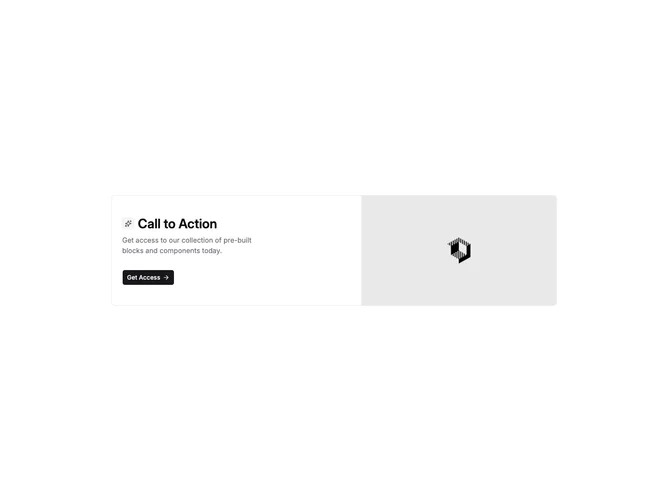
Cta1 is a split card call-to-action built with shadcn/ui: the text column opens with a muted icon chip and headline on one line, then supporting paragraph, then one button that includes a trailing arrow icon. The opposite column shows a rectangular image sized to match the card height on larger breakpoints.
A thin border wraps the whole card with rounded corners; the icon treatment and typography mirror other side-image CTAs in the set. Visual emphasis stays on the headline and photography, with the button as a single clear exit. This version places copy first and imagery second in the DOM order, which affects reading order on stacked mobile layouts compared with variants that lead with the photo.
The block is a compact promotional row rather than a full hero. It is simpler than multi-button strips because only one action appears. Swap placeholder icon, strings, link, and asset to reuse.
Small screens stack text above the image block inside the same bordered frame.