
Coverflow 6 block design & features
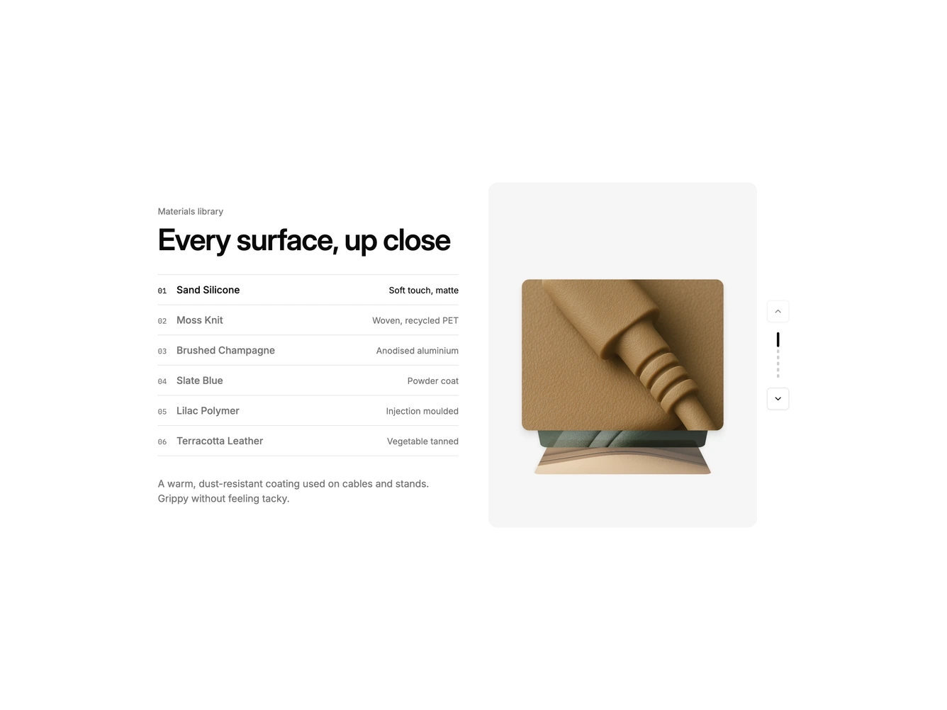
Coverflow6 turns the cover flow on its side. This Shadcn UI block uses two columns: the left holds a heading, a numbered list of materials with their finishes, and an animated description of the current item. The right column is a tall muted panel where landscape cards are stacked vertically, with the active card flat and its neighbors tilted back above and below it. A slim column of up and down buttons and a stretching progress indicator sits beside the panel.
Cards fold away along the horizontal axis with a long ease, and soft gradients at the top and bottom of the panel blend them into the background. The list uses hairline dividers and muted text that brightens for the active row.
It reads as precise and product-minded, like a materials catalog or spec sheet. Scrolling the mouse wheel over the panel steps through items until the first or last card is reached, then the page continues scrolling as normal. It needs close-up images with a name, finish, and one-line description for each.
On mobile the columns stack, with the list above the vertical stage.