
Coverflow 14 block design & features
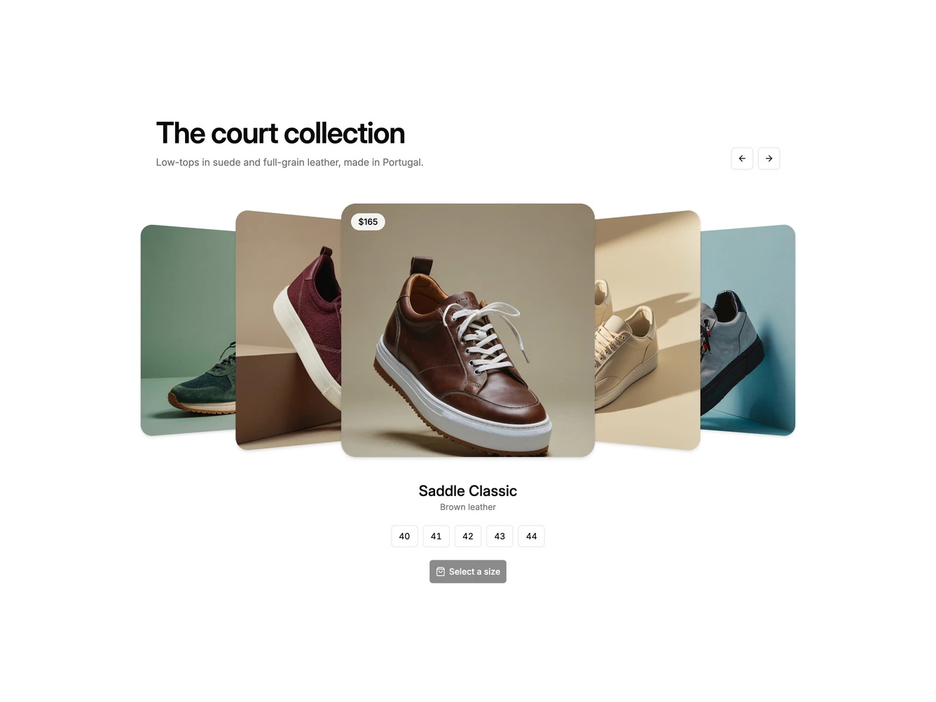
Coverflow14 brings the cover flow to a product listing. This Shadcn UI block has a heading and description on the left with arrow buttons on the right, then a row of square product cards in a cover flow, and a product panel underneath with the name, material, a row of size buttons, and an add to bag button.
The centered card shows a small price pill and swaps to a second angle on hover, while the side cards recede and turn away. The product panel animates in whenever the selection changes. Size buttons are compact outlined squares that fill when chosen, and the add to bag button stays disabled until a size is picked.
It feels polished and retail-ready, a more playful alternative to a standard product grid. The loop wraps both ways and any visible card can be clicked to focus it. It needs two product images, a name, material, price, and size list for each item.