
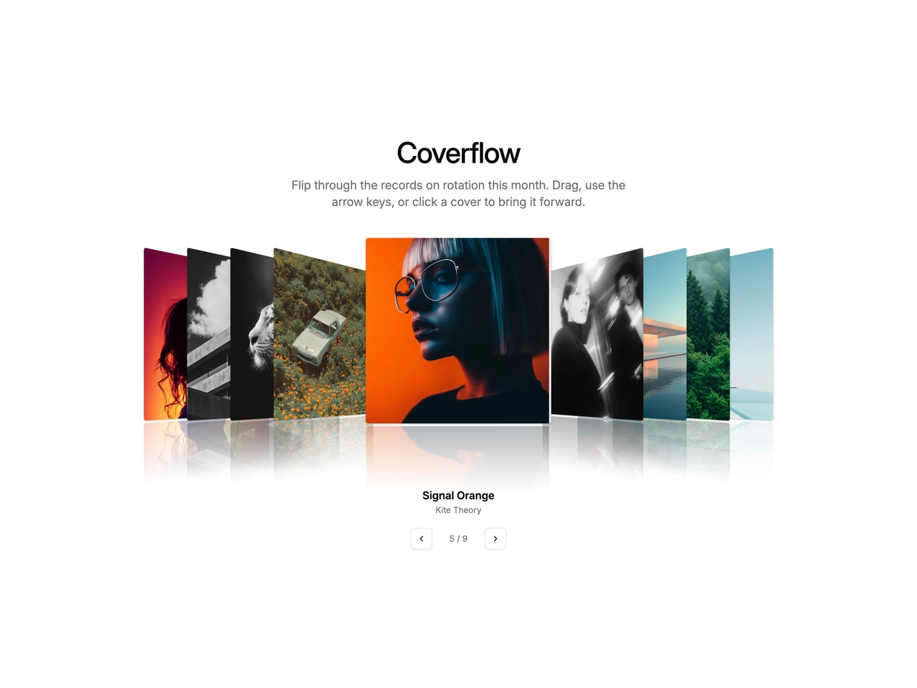
Coverflow 1 block design & features
Coverflow1 is a shadcn/ui take on the original music library cover flow. A centered heading and short description sit above a row of square album covers. The active cover faces forward while the covers on either side turn away in perspective and stack tightly toward the edges. Under the row, the album title and artist update as the selection changes, next to outline arrow buttons and a position counter.
Each cover has a faded mirror image beneath it, so the row appears to stand on a glossy floor. Transforms ease with a long, soft curve, so covers swing into place rather than snapping. Covers are sharp-cornered with deep shadows, and the type is kept small so the artwork does the talking.
The look is nostalgic and tactile, a deliberate nod to early desktop media players. Navigation works by dragging or swiping the row, pressing the left and right arrow keys while the row is focused, clicking any visible cover, or using the arrow buttons. It needs a set of square cover images plus a title and artist for each.
On small screens the covers shrink and the side spacing tightens, so roughly five covers stay visible.
The row advances on its own every few seconds and returns to the first cover after the last. Autoplay pauses while the pointer is over the covers, during a drag, or while the row has keyboard focus, and it stays off for visitors who prefer reduced motion. The interval is a prop.