Contact 34 block design & features
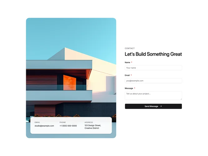
Contact34 is a contact pattern built with shadcn/ui that reads as a five-part grid on large screens: the visual side spans three parts and shows a large rounded photograph with a bottom-anchored panel holding uppercase labels for email, phone, and street address with tappable mail and tel links. The form side spans two parts, vertically centered with an uppercase tagline, headline, and fields for name, email, and message plus a button that pairs label text with an arrow-in-square icon.
The overlay panel uses a near-opaque surface, light blur, and shadow so copy stays legible on top of photography, and the image ratio shifts between wider and taller proportions at different breakpoints. Field labels follow the library field pattern with required markers on inputs.
The look skews editorial and premium because imagery outweighs the form, and the floating detail plate is the clearest differentiator from a plain split layout.
The inset spacing on the overlay keeps it away from the frame edges on both phone and desktop widths.