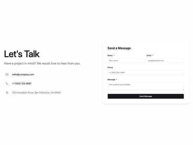
Contact 30 block design & features
Contact30 is a viewport-tall contact section built with shadcn/ui on a muted neutral background. A two-column row places a large headline and supporting line with three outbound methods on the left, each marked by a circular white icon badge with shadow. On the right, a raised white card holds name, email, optional phone, and message fields.
Content stays vertically centered within the minimum viewport height. The headline uses very large type with tight letter spacing. The circular badges read as discrete chips lifted by drop shadow. Form fields round corners generously and carry a pronounced card shadow underneath.
Bold and headline-led: occupying the viewport signals that contact sits at page level rather than squeezed into a footer. Shallow layering comes mostly from typography scale, icon circles, and the single floating card rather than patterned decoration.
When columns stack, headline and badges come first while the white card expands to nearly full width on small screens.