Contact 29 block design & features
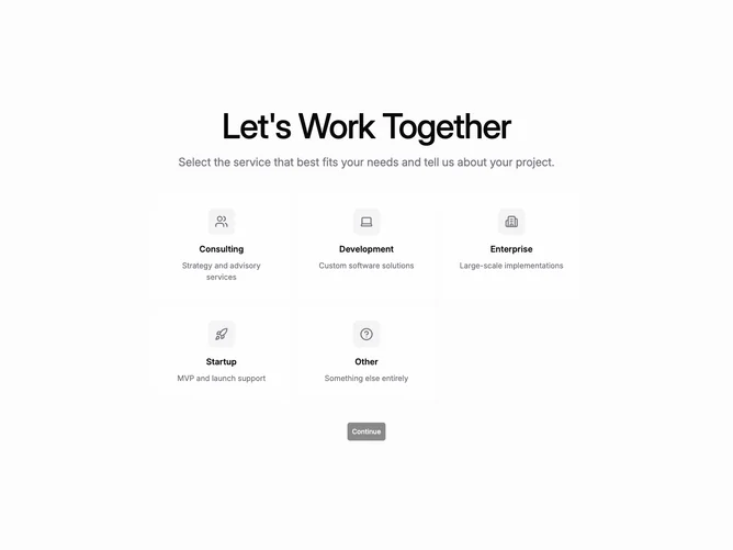
Contact29 is a two-step flow built with shadcn/ui on a muted full-height background. The first step centers a responsive grid of five service cards with large circular icon containers, titles, and short descriptions. Selecting a card adds a saturated ring outline and heavier shadow before a continue button activates.
Step two splits into explanatory headline and paragraph on one side and a white card form on the other. The card captures name, email, optional company, and message plus an understated link to return and change services. Submission yields a centered success layout with affirmative message copy.
Marketing-forward yet structured: big iconography lets users scan categories before any typing begins. Anchoring explanatory copy beside the card keeps framing text visible alongside short fields. This is moderately complex owing to selectable services, staged layouts, and a dedicated success panel.
Small screens tighten the grid, stack the explanatory column ahead of the form card, and keep the headline readable above the folded fields.