Contact 25 block design & features
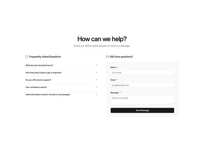
Contact25 pairs self-serve answers with outreach in one row built with shadcn/ui. The left rail opens with a small icon and heading over a five-item accordion. The right rail repeats that header pattern above a muted, rounded shell that wraps name, email, and message inputs.
Only one accordion item stays expanded at a time. The muted shell reads as a soft inset; inputs stay bright so fields feel tactile. Submission shows inline field issues and swaps in a concise success acknowledgement instead of noisy chrome.
Operational support tone: balanced column widths make FAQ reading and form submission feel equally legitimate. Accordions tame long policy text without turning the section into one dense wall.
Small screens stack the accordion above the panel so answers appear before typing.