

Contact 20 block design & features
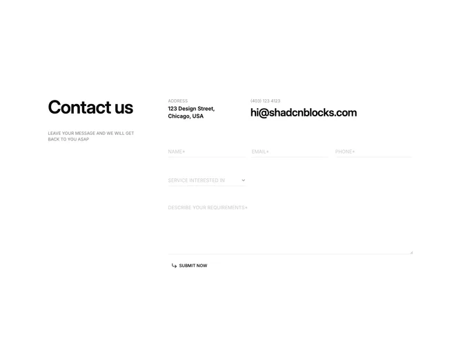
Contact20 builds a two-band contact module with Shadcn UI. The upper band pairs a bold title and uppercase eyebrow on the left with a split info cluster on the right that lists address lines beside an outsized email treatment. The lower band stretches a three-column grid of underline-only fields for name, email, phone, service choice, and a spanning message area, with a ghost arrow submit tucked at the start of the last row.
Chrome stays intentionally thin: no filled boxes, only hairline bottoms, uppercase placeholders in washed tones, and a borderless select that mirrors the text inputs. Typography scales jump between tiny labels and the loud mailbox link so hierarchy scans quickly.
The look is editorial and restrained, relying on grid rhythm and case choices instead of cards or shadows. It differs from a padded form tile because the canvas stays open.
When horizontal space disappears, the grid reflows while preserving label-first scanning so address context still lands above the field matrix.