

Contact 18 block design & features
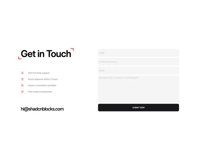
Contact18 splits attention across two columns built with shadcn/ui. The narrative side stacks an oversized headline framed by small red corner brackets, four stacked support rows with red square icons and upward chevrons, then a large plaintext mail link. The working side is a form with rounded muted fields for name, optional phone, email, and message, capped by a full-width rounded submit.
The page ground stays white while red repeats on brackets, icon tiles, and accents so the section feels spirited but controlled. Display type dominates the left stack, placeholders shout in uppercase to match the graphic tone, and the button spans the field column for a single decisive action.
It reads bold and slightly playful because illustration-like brackets sit beside enterprise-grade form controls. The list-and-form pairing explains promises before asking for details.
Layout compresses to one column on small screens so story and fields stay sequential without losing the accent color rhythm.