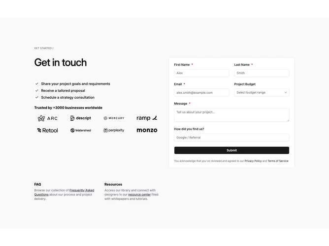
Contact 17 block design & features
Contact17 is an elaborate lead capture layout built with Shadcn UI on a muted section ground. A small eyebrow label tops the block before the grid splits: left carries the headline, three checklist-style process lines with round icons, a credibility line, and eight monochrome logos in a four-by-two grid; right holds a white bordered card with first and last name, email, budget select, message, referrer line, and tiny acknowledgement copy under the submit. A slim footer row points visitors toward FAQ and Resources.
Visual weight tilts toward the white card while the proof column stays quieter. Check glyphs sit in soft circular badges, logos repeat in a tight matrix, and the dropdown reads as a qualifying step ahead of the textarea.
Complexity comes from stacking reassurance before fields: staged steps, logos, then structured inputs including budget band choice. Filling the logo grid matters so the proof band does not look sparse.
On narrow screens the proof stack leads and the card drops beneath so messaging still lands before the form fields.