Contact 1 block design & features
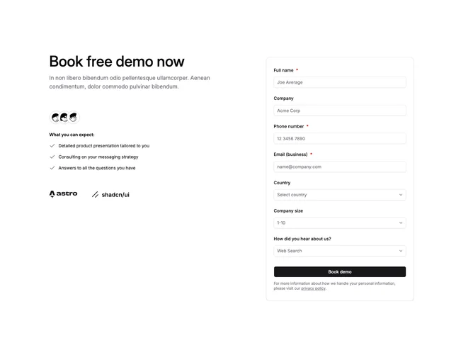
Contact1 is a two-column demo booking section built with shadcn/ui: social proof on the left and a detailed form on the right. The left column has a headline, supporting copy, an overlapping avatar stack, three benefit lines with icons, and a row of company logos. The right column is a card with full name, company, phone, email, and selects for country, company size, and referral source.
Soft radial gradients in accent tones sit behind a light dot pattern so the section reads layered rather than flat. The form lives in a bordered card with shadow. Avatars overlap with thin rings, benefit icons stay muted, and spacing stays roomy so the hierarchy stays obvious.
This is an elaborate pattern compared with a simple inquiry form: avatars, logos, and benefit lines carry trust before the fields. You need real avatar images and logo artwork for it to feel intentional rather than placeholder.
On smaller widths the layout stacks so the narrative column leads and the form follows in reading order.