Compliance 6 block design & features
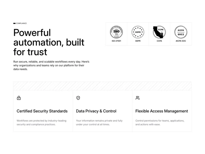
Compliance6 pairs editorial copy with a modular certification matrix built with Shadcn UI. On wide layouts the left stack shows a tiny horizontal accent, uppercase “Compliance” eyebrow, outsized multi-line title about automation and trust, and an introductory paragraph about secure workflows. The right block is a grid of bordered cells with hairline gutters, each containing a centered badge SVG and uppercase label for ISO 27001, GDPR, CCPA, and AICPA SOC. Below, a full-width panel adds a decorative diagonal stripe header on medium and up, then presents three equal-height columns with Lucide icons, medium titles, and muted descriptions for certified security standards, privacy control, and access management.
The look is structural: visible borders, uppercase micro labels in the grid, and generous vertical separation between the hero band and the lower triptych. Icons are line weight and understated so text leads.
Complexity straddles simple and moderate: you need accurate certification art and legally vetted claims, but there are no interactive widgets. The lattice treatment makes the section feel like a compliance dashboard excerpt.
Responsive rules stack the hero text above the grid on small screens, collapse the stripe header on mobile, and switch the lower area from one column to three when space allows.