Code Example 14 block design & features
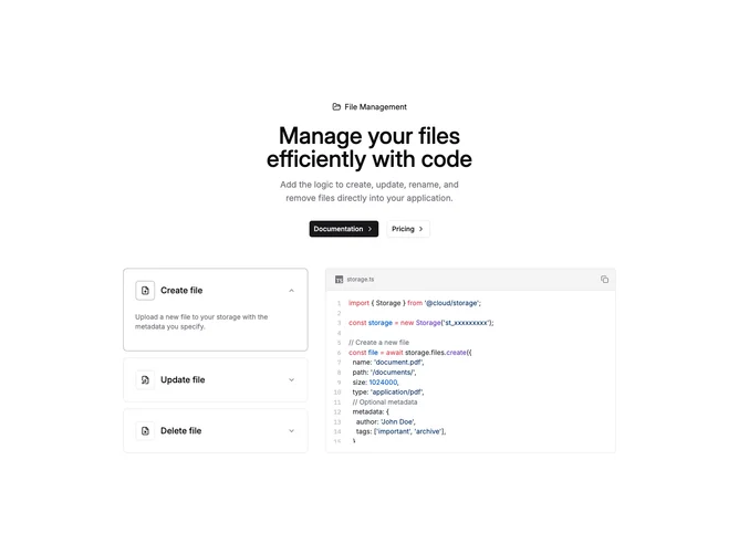
CodeExample14 is a two-column documentation section built with shadcn/ui, pairing an accordion on the left with a live code sample on the right. The hero band uses a label with folder icon, headline, supporting copy, and primary plus outline buttons. Three accordion items cover create, update, and delete operations; expanding an item shows a short explanation while the code block updates to the matching SDK snippet. State ties the open accordion value to the displayed TypeScript.
Behind the hero sits a subtle dot grid masked in a soft ellipse so the top of the section feels textured without stealing contrast from text. Accordion rows use bordered cards that gain a primary-tinted border when open. Icons sit in small square frames beside each title. The code card is full width of its column with horizontal scroll for long lines.
This pattern is useful when you want narrative steps beside one canonical file. Complexity sits in content maintenance (three code bodies) rather than exotic UI. The sample imports a fictional storage package; you would align names and APIs with your product.
On large screens the accordion and code sit side by side; on small screens they stack with the accordion first so users pick a scenario before scrolling to the snippet.