Case Studies 9 block design & features
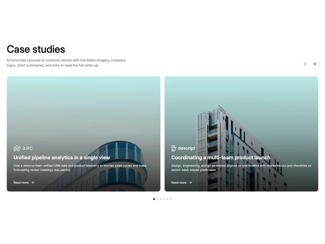
A section heading with arrows sits above a Shadcn UI carousel that shows two case study cards at half-width each on medium screens and up. Cards use a landscape 4×3 aspect ratio, giving wider frames than the portrait variants. Each card layers a company logo, single-line title, two-line description, and a read-more link with arrow over darkened photography. Arrows and dots advance one card at a time with no edge gradient masks.
The wider aspect makes photography more cinematic and gives the overlay text more horizontal room. A bottom-up gradient from black keeps text legible while leaving the upper portion of the image mostly clear. Rounded corners, generous inner padding, and a light hover zoom keep the cards feeling polished without extra decoration. Dot pagination sits centered below the track.
The feel is clean editorial with enough card area to show both headline and excerpt comfortably. Two visible cards at once strikes a balance between density and breathing room, making it suited to sections where each story deserves more surface than a three-up grid offers.
On small viewports the carousel collapses to a single full-width card per snap.