Case Studies 12 block design & features
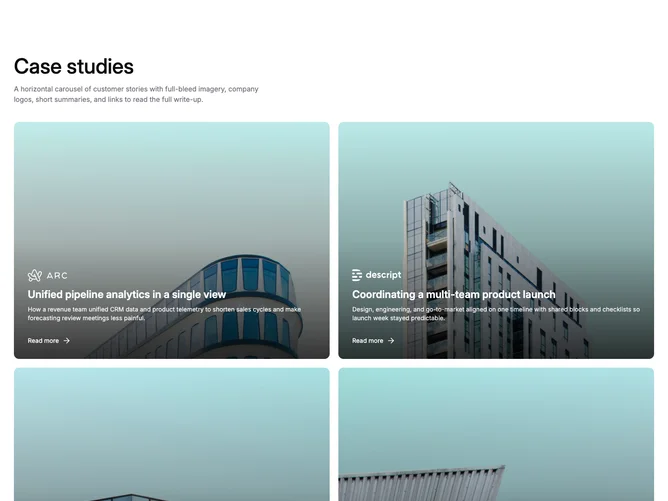
A section heading and description lead into a two-column, two-row grid of case study cards built with Shadcn UI utility patterns. Each card uses a landscape 4×3 aspect ratio with full-bleed photography, a bottom gradient overlay, company logo, single-line title, two-line description, and a read-more link with trailing arrow icon. No carousel, no arrows, no pagination.
The landscape format gives each card a cinematic frame that fills the available column width. White text sits over the darkened lower portion of the image with generous padding. Rounded corners, a subtle image zoom on hover, and uniform gap spacing keep the grid feeling polished. The two-column layout gives each story substantial visual weight compared to three-up grids.
The overall aesthetic is editorial and content-forward. Four items shown simultaneously offer a balanced amount of social proof without requiring interaction. This is a low-complexity block with no state management: just a grid of linked cards.
On small viewports the grid collapses to a single column and cards stack vertically. Content is capped at four items.