Case Studies 11 block design & features
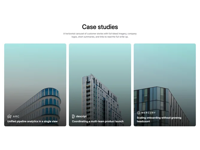
A centered section heading and description sit above a static three-column grid of case study cards, built without any carousel or navigation controls. Each card uses a portrait 3×4 aspect ratio with full-bleed photography, a bottom gradient overlay, a company logo, and the story title. No descriptions or read-more links appear on the cards, keeping the treatment minimal and poster-like.
The centered heading gives the section a formal, presentation-style opener. Cards have rounded corners, a subtle hover zoom on the image, and white text over the darkened lower third. Spacing between cards is uniform and moderate. The overall density is low since only three items are shown at any time.
The feel is clean and gallery-like with minimal interactivity. This is the simplest variant in the case-studies family, suited to pages where three featured stories are enough and scrolling through a longer list is unnecessary. Complexity is very low: a static grid with no state management.
On small viewports the three cards stack vertically at full width. Content is capped at three items.