Case Studies 10 block design & features
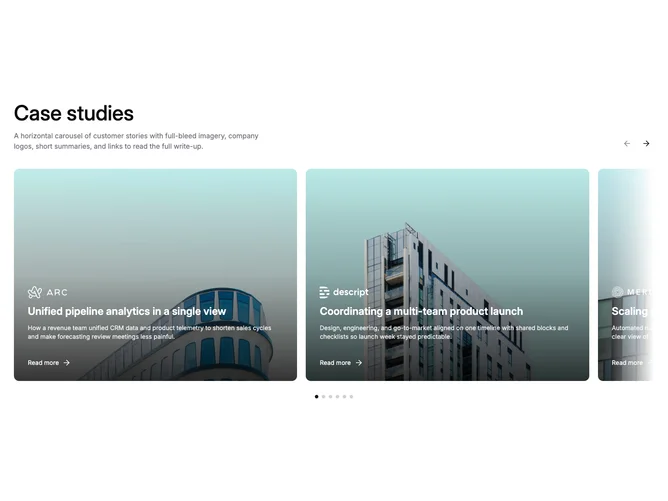
Built with Shadcn UI carousel primitives, this variant shows two landscape case study cards that take slightly less than half the container width each, letting the next card peek in from the right edge. Soft left and right gradient masks fade the carousel edges into the page background, signaling scrollable content without clipping card corners. Each card has a 4×3 aspect with full-bleed photography, bottom gradient, logo, title, description, and a read-more link. Arrows and dots advance one card at a time.
The masks use color-mix in oklab for theme-safe transparency, transitioning smoothly regardless of whether the page background is light, dark, or colored. Cards have generous padding on the text overlay, rounded corners, and a hover zoom. The peeking card creates a visual invitation to scroll without requiring explicit affordances like a "see more" button.
The mood is polished marketing editorial. The combination of peek and mask adds a sense of depth and continuity that the unmasked two-up variant lacks, making it feel more dynamic while still being content-driven rather than code-driven in complexity.
On small viewports the cards fill roughly 85% of the width so one card shows with a peek. The masks fade out at the start and end positions so the first and last items render unobstructed.