Background Pattern 60 block design & features
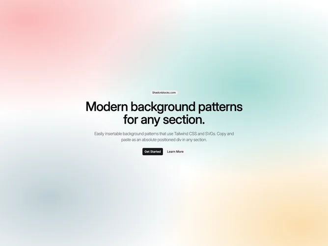
The BackgroundPattern60 component is a visually striking shadcn component designed to provide an atmospheric backdrop through an intricate pattern of gradients and colors. It acts as a foundational shadcn block, offering a vibrant, dynamic background that supports other components and visual content without overwhelming them. It integrates seamlessly into a wide range of layouts, enhancing the aesthetic appeal of the user interface with minimal setup.
In more detail, the BackgroundPattern60 achieves its vibrant effect through the use of layered radial and linear gradients configured to create an "Aurora Dream" atmosphere. This is done by leveraging shadcn ui's customizable color properties, allowing designers to adjust lightness, chroma, and hue to suit their thematic needs. Positioned to cover the full viewport height and width, this component anchors itself at the center of the display, creating an immersive backdrop. Additionally, the inclusion of a PatternPlaceholder allows for further customization or to serve as a placeholder for additional content or UI elements, making BackgroundPattern60 a highly adaptable and visually compelling choice for developers looking to enhance their visual presentations with sophisticated design elements.