
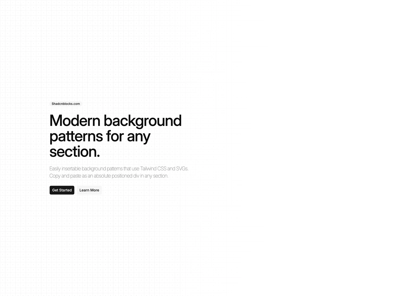
Background Pattern 131 block design & features
The component, BackgroundPattern131, serves as a visually distinct section within a user interface, creating an engaging background pattern that draws attention and enhances the overall aesthetic. This shadcn block is designed to occupy the full width and height of the viewport or a designated space, positioning itself as a focal area with a visually appealing dynamic pattern. By incorporating a flexible className property, this component allows for further customization to fit various design needs, ensuring that it can adapt to different layouts and styling requirements.
In more detail, BackgroundPattern131 features a unique dual-layer design: a right-masked white grid dotted background paired with a radial pattern. The component utilizes advanced CSS properties to generate a multi-layered background effect with linear and radial gradients, creating a sophisticated visual complexity. The shadcn ui elements used in this component, such as the ability to seamlessly blend with the existing design system through configurable CSS variables, make it a preferred choice for developers aiming to elevate the visual hierarchy and depth in their applications. Additionally, the integration of the reusable PatternTemplate component allows for coherent theming and design consistency across different sections of an interface, facilitating a high degree of visual cohesiveness.