Background Pattern 111 block design & features
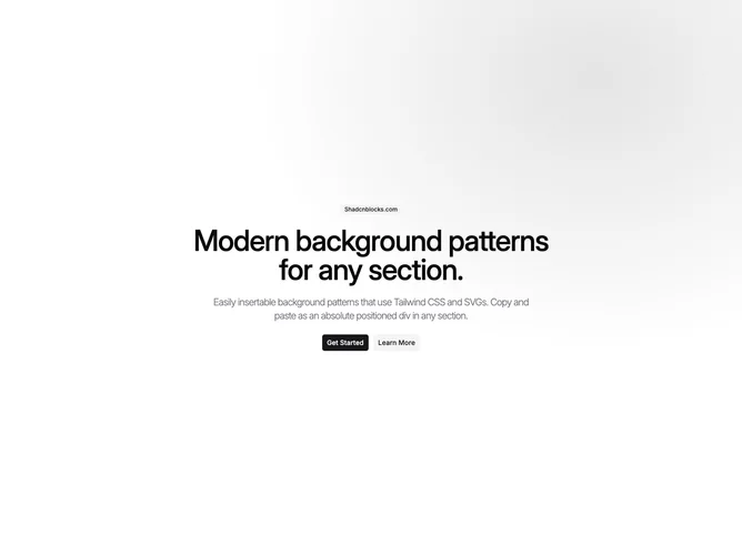
BackgroundPattern111 is a full-height centered section built with Shadcn UI, with a tiled primary-colored dot mesh behind centered content. The vignette sits toward the upper right, so the grid falls off as you move left and across the canvas. PatternPlaceholder marks where real hero or page content would go.
The dots use your theme primary with boosted chroma so the grid stays legible on both light and dark themes. The mask creates an elliptical spotlight rather than a flat full-bleed texture. Spacing stays generous around the centered block. Nothing animates.
This is a small, CSS-only background: one texture layer plus a demo placeholder. The asymmetric anchor is the main twist compared with a centered fade. Complexity is low and you mostly swap copy and hook up your own children instead of PatternPlaceholder.
The outer section fills at least the viewport height. Pass className on the section when you need different padding or max width.