Background Pattern 106 block design & features
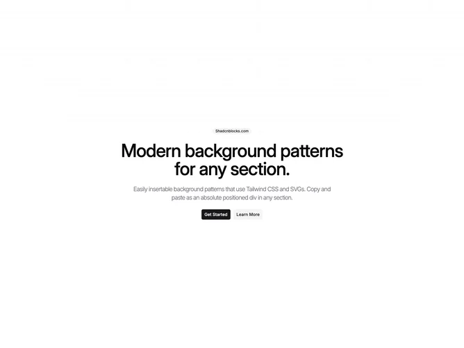
The BackgroundPattern106 component serves as a visually striking section container that incorporates a complex, layered background pattern. This shadcn ui element is designed to fill the entire viewport height and width, centering its child content both vertically and horizontally. Targeting applications where a sophisticated background is required, this component enriches the visual appeal of any layout by providing a uniquely styled pattern as a backdrop.
In detail, the BackgroundPattern106 component features a multi-layered grid pattern that employs repeating linear gradients. The design utilizes various opacities and shades to create depth and visual interest, culminating in a top fade effect achieved through radial gradient masking. As a shadcn block, it leverages CSS custom properties to adapt to different theming needs, ensuring consistency across different contexts within the application. The inclusion of a PatternPlaceholder allows for further customization or extension, highlighting the component's flexibility in catering to diverse design requirements.