
Accept Invite 3 block design & features
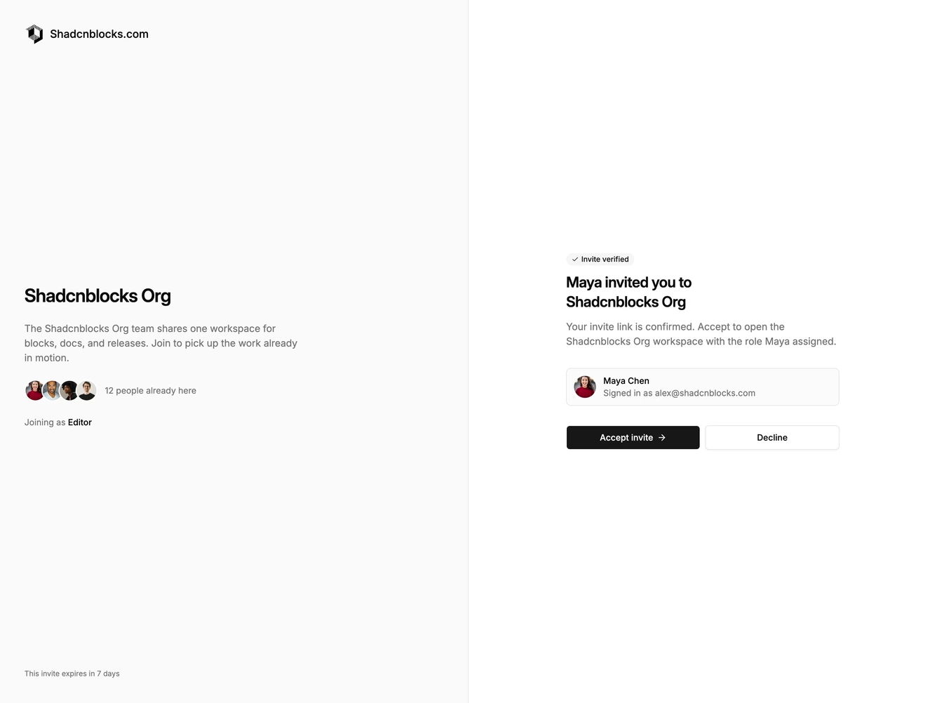
AcceptInvite3 is a fullscreen split accept-invite layout built with shadcn/ui. The left column holds workspace branding: a logo and name, a short description, a row of stacked member avatars with a headcount line, and the role the guest will join as. The right column is the decision surface: a verified badge, a heading naming the inviter and workspace, supporting copy, a compact inviter row with email, then accept and decline buttons.
The left pane sits on a muted surface with a hairline divider. Avatars overlap with a tight ring so the group reads as one cluster. The right pane stays on the default background with a spacious centered column. The verified badge uses a secondary fill and a small check icon. Buttons sit side by side on larger screens and stack on small ones, with the primary action carrying a trailing arrow.
This is a moderate, app-style confirmation rather than a sign-in form. The split keeps workspace context visible while the guest decides, which is a fresher take than a single centered card. Complexity is mixed: CSS-driven layout and avatar stacking plus content for members, role, and inviter details.
On small screens the branding column hides and a compact logo row plus the expiry line move into the decision column so the page still identifies the workspace.