Product Page 3 page design & features
Product-page3 is a Shadcn UI product page built around an inbox metaphor. The navbar opens on a hero with layered wide-and-tall frames suggesting email or messaging UI, three feature bands with checkmark grids explain benefits, a centered testimonial stack with read-more affordance adds proof, and a footer with theme controls closes the layout.
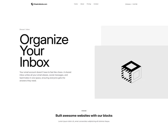
Layered frames make the hero feel like a live product capture rather than abstract illustration. Testimonials appear late, after capability bands, which mirrors how users want validation once they understand features.
Tone is workflow SaaS: practical checklists, realistic UI photography, and subdued footer chrome. It is more narrative than product-page1’s analytics focus.
Layered hero imagery simplifies on small screens and testimonial stacks become single column lists.