Landing Page 1 page design & features
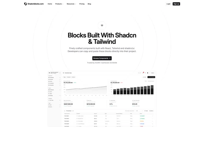
Landing-page1 is a classic shadcn/ui homepage built entirely from free blocks, making it a practical starting point without a paid subscription. The flow runs navbar with icon dropdown menus, a centered hero with concentric ring decoration and capped hero image, a headline-free logo grid, an icon-led reasons section with centered call to action, staggered testimonial columns, two-plan pricing with a monthly or annual switch, a banded dual-button CTA, and a compact multi-column footer.
The palette stays light and restrained: muted panels behind imagery, pill buttons, and generous whitespace between text stacks. Nothing relies on heavy animation beyond hover on controls, so the page reads calm and wireframe-adjacent in places, especially around the hero rings and simple logo strip.
This layout targets teams who want a credible SaaS shell quickly. It is simpler than feature-heavy or carousel landing variants because it omits galleries, stats, or integration marquees, but still covers the full conversion arc from hero through pricing to a final CTA.
On narrow screens the hero, testimonials, and pricing blocks stack naturally while the navbar collapses to a sheet menu.