Testimonial 16 block design & features
The Testimonial16 component is a versatile testimonial display block designed to showcase user feedback or reviews in a visually engaging manner. Using a list of testimonial entries, each identified by an author, avatar, and content, this shadcn block presents testimonials in a sleek grid layout. The component is interactive, allowing users to expand and view the full content of each testimonial, enhancing the user experience by making details easily accessible.
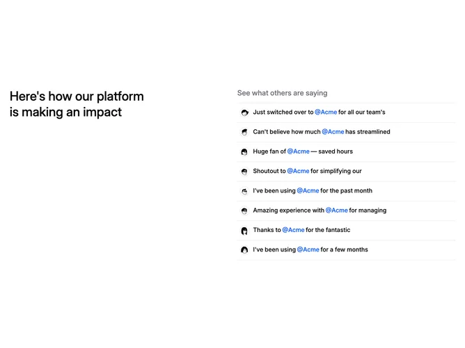
At its core, this shadcn component is structured to display testimonials in a two-column grid. One column is dedicated to the heading, providing an impactful introduction, while the other column focuses on the actual testimonials. Each testimonial card includes a visual representation of the author through an avatar and contains a snippet of the tweet, which can be expanded to reveal the full content. The design incorporates seamless transitions and interactive elements that enhance the engagement and readability of content within the layout. By organizing testimonials in such a modular format, it presents a scalable solution for incorporating extensive user feedback.