Testimonial 11 block design & features
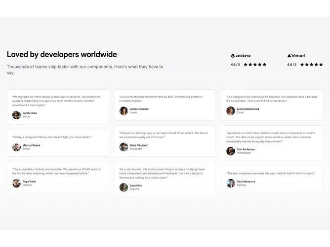
The Testimonial11 component is a well-structured shadcn block for displaying customer testimonials, integrated seamlessly with an attractive visual appeal. It features a vertically aligned, text-centric design that highlights feedback from customers, making it an ideal choice for showcasing user experiences effectively. This component uses a dynamic approach to present testimonials, accommodating up to nine individual entries with a strategic layout adjustment for different screen sizes.
Delving into the design, Testimonial11 showcases testimonials in a grid-like structure that adapts to the available visual space, displaying varying numbers of testimonials per row based on the screen size. The component's backdrop has a gradient styling, enhancing visual separation between dynamic elements and the overall setup. Key details such as customer ratings are accentuated with star icons and framed alongside logos to maintain brand identity and add a visual touch. The avatar integration utilizes the shadcn block's avatar components, bringing a personal touch to each testimonial by featuring user images and fallback options. This design approach ensures the feedback remains the focal point while maintaining consistency across differing user scenarios.