Services 6 block design & features
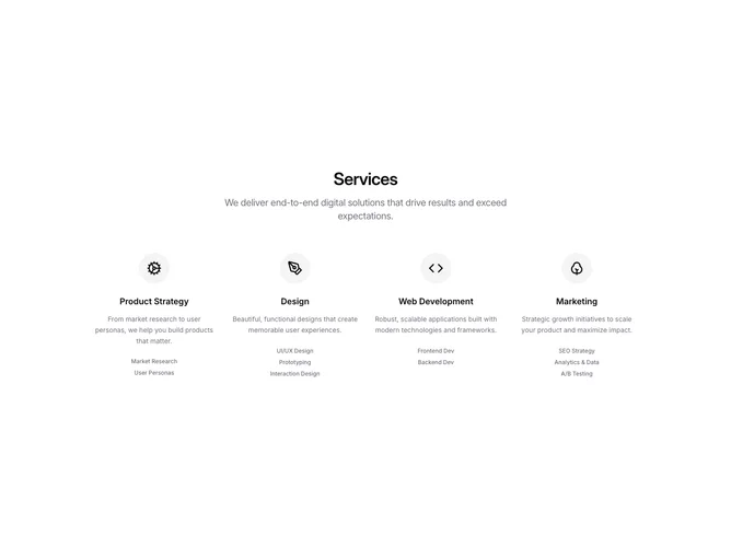
The Services6 component is a sophisticated shadcn ui block that visually presents a range of services in a well-organized and modern layout. This shadcn component is designed with flexibility in mind, displaying essential service information in a clear and appealing manner. It features an attractive header and a set of service cards, each adorned with an icon, title, and descriptive text, providing a cohesive and informative display to engage users effectively.
In more detail, the Services6 component leverages shadcn design principles to offer an intuitive and compact service overview. Each service card within the grid layout includes a distinctive icon and a description that succinctly communicates the value proposition of the service. The component utilizes responsive design elements such as a dynamic grid layout that adjusts from a single column on smaller screens to multiple columns on larger screens. Transition effects provide visual cues to enhance user interaction, creating a responsive experience that highlights the details of each service offered.