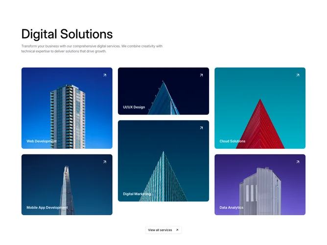
Services 15 block design & features
The Services15 component is designed to showcase various service offerings with an engaging visual layout. It presents a series of service cards, each featuring a title and an image, using a masonry-style arrangement. This design enhances the visual appeal by varying the heights of the service cards, providing an enticing overview of the digital solutions available.
The component leverages a combination of images and animated interactions to highlight services offered, making it an effective tool for drawing user attention. Upon hovering, a card accentuates its presence through a subtle motion effect and a dynamic color overlay, inviting users to explore further. At the bottom, a button encourages users to view all services, maintaining engagement with a consistent call-to-action element. This shadcn ui component effectively integrates animation and design, enabling organizations to promote their services in a visually compelling manner.