Services 10 block design & features
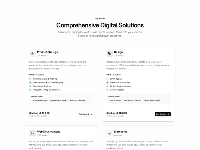
The Services10 component is a Shadcn UI block designed to showcase a suite of service offerings with a clean, organized layout. It highlights various service categories, each with specific features, deliverables, duration, and pricing details. This component effectively communicates clear value propositions for potential clients interested in digital solutions tailored to unique business needs. With a design focused on accessibility and user engagement, Services10 serves as an ideal template for businesses looking to present their service capabilities in a visually appealing manner.
Drilling down into its design, the Services10 component incorporates concise service descriptions paired with interactive elements to help users easily understand and navigate the different offerings. Icons augment the clarity by providing quick visual references for each service category. The component distinguishes between featured and non-featured services using background and border styling, creating an intuitive hierarchy that guides user attention effectively. By utilizing grid layout and responsive elements, it maintains visual consistency across devices while facilitating user interaction with call-to-action buttons and customizable quotes.