Services 1 block design & features
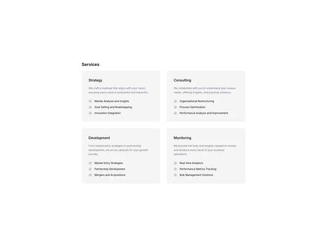
The Services1 component presents a structured and visually appealing way to showcase various service offerings. By utilizing a grid layout, the component effectively organizes and displays detailed information about diverse services, allowing users to effortlessly understand what each service entails. The component features a clean and modern design, characterized by its use of subtle colors and typography, enhancing the readability and aesthetic appeal.
Delving into the specifics, the Services1 component comprises a series of service blocks, each highlighting key aspects such as title, description, and a list of items related to the service. The use of subheadings and bullet points ensures clarity and accessibility, while iconography adds a layer of visual guidance. This shadcn component is an excellent choice for those looking to present complex information elegantly and coherently, leveraging the utility and design consistency that shadcn UI blocks provide.