Projects 18 block design & features
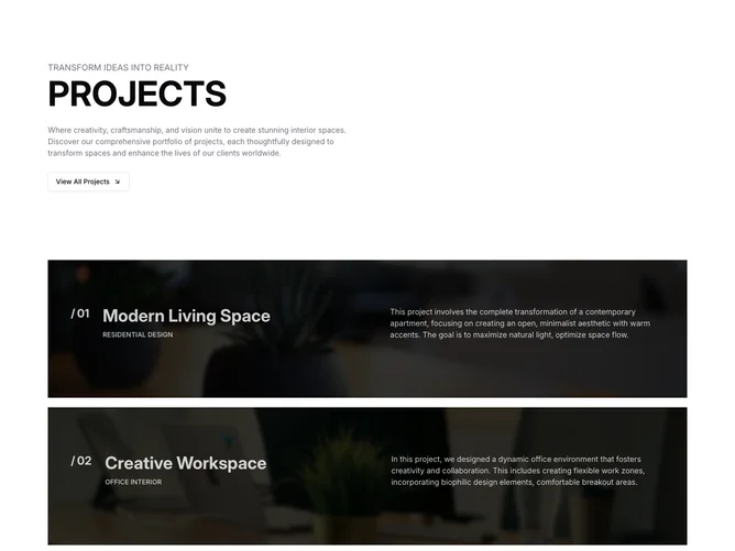
This component, a shadcn block, serves as a project showcase section designed for displaying a collection of architectural and interior design projects. The component features a structured layout that highlights key aspects of each project, such as its name, type, and a brief description. It organizes the projects in a visually appealing format with background images that represent each project, supplemented by interactive elements such as hover effects and buttons to facilitate navigation.
In greater detail, the component is structured to deliver an immersive browsing experience by leveraging visual elements and animations. Each project is displayed as a separate block containing a project-specific image as the background. Upon hovering over a project, the component reduces the image opacity to bring attention to a textual overlay containing further project details. Additionally, a button appears, inviting users to explore the project in more depth. This design enhances user engagement by blending aesthetics with functionality, typical of a shadcn UI-driven approach.