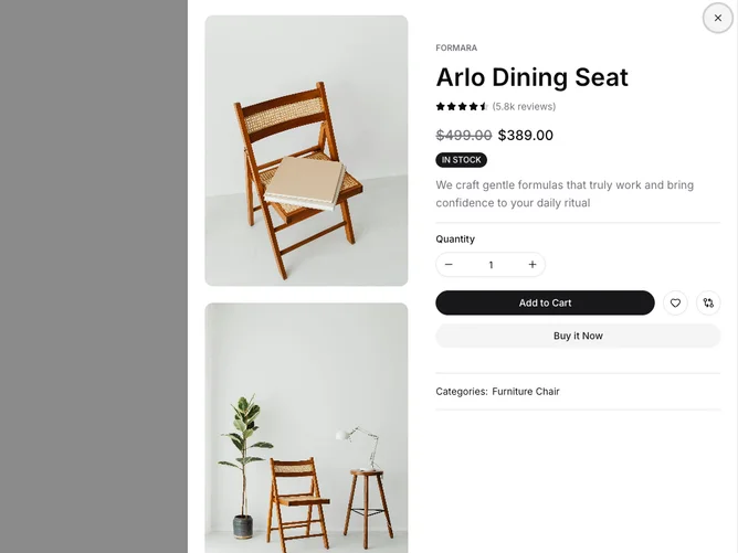
Product Quick View 6 block design & features
This component, referred to here as a shadcn block, is designed to provide a detailed quick view of a product within an e-commerce setting. By consolidating various product attributes such as images, pricing, reviews, and stock status, it delivers a streamlined and informative snapshot that aids users in making purchasing decisions. The composite layout features a carousel for image browsing, a rich textual description, and interactive elements for user engagement, all encapsulated within a modal-like interface designed for instant access without navigating away from the main page flow.
Diving deeper into its composition, the shadcn component underscores its versatility through a host of interactive features tailored to enhance user experience. It integrates a shadcn ui carousel for seamless image exploration, an intelligently structured form for adjusting product quantities, and quick access buttons for cart management and brand/product detail exploration. The component intelligently divides the screen space, balancing between visual and textual information. Notably, its distinct usage of shadcn ui elements like badges and bespoke layout responsiveness ensures that the user interface remains coherent and visually appealing across different device sizes. Overall, this block stands out for its comprehensive feature set and efficient use of space to maximize user engagement and facilitate informed purchasing decisions.