Pricing 40 block design & features
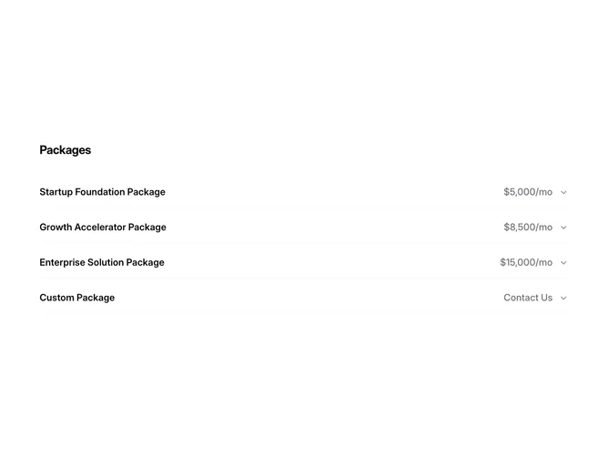
The Pricing40 component showcases different package offerings, allowing users to explore detailed information about each package in a structured manner. Utilizing shadcn UI elements like accordions, the component efficiently organizes and presents extensive content, such as the package details, within collapsible sections, enhancing readability and navigation for the users. This component is particularly suited for displaying package-based services or product offerings where multiple details need to be conveyed in a concise format.
Expanding on its functionality, the Pricing40 shadcn block provides an interactive and organized way to display comprehensive information about various service packages. Each package, represented as an accordion item, reveals intricate details upon interaction, including categories such as "What I do," "What you get," and "Ideal for." This design addresses diverse business needs by offering varying levels of service packages, ranging from startup support to enterprise solutions. The component's layout is designed to highlight critical information effortlessly, making it easy for users to compare and select services that best suit their requirements.