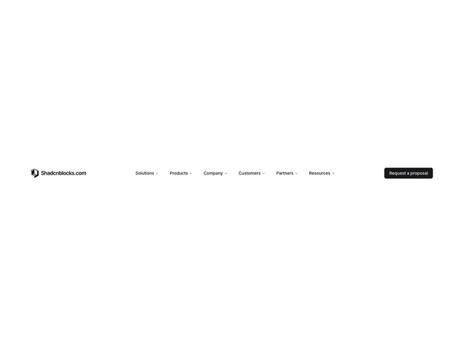
Navbar 4 block design & features
Navbar4 is a site-wide navigation shell built with Shadcn UI, pairing a logo lockup with five mega menu categories: Solutions, Products, Company, Partners, and Resources. Each dropdown fills a near full-viewport panel with multi-column grids, primary-colored promo cards, product thumbnails, regional location lists with flag emoji, partner story tiles, and dense link groups with icons. A single Login button appears on desktop; mobile uses a fullscreen overlay with back navigation between root links and the same mega content inlined below section headings.
Primary and accent surfaces anchor large hero cards inside menus, often with photography bleeding to card edges. Typography scales from uppercase micro labels to bold link titles. Many rows include arrow nudges on hover for affordance. Borders separate nested lists inside bordered mini-cards, especially in the solutions grid of four product pillars each with five sub-links.
Highly complex and content-heavy: this block simulates a global software company IA with regions, partner programs, and resource hubs. It stands out for breadth rather than minimalism and expects substantial real copy, icons, and images to avoid feeling like placeholder filler. CSS-driven structure carries most of the layout; dozens of links and cards are content-driven.
Mobile reuses the mega components inside a scrollable drawer rather than simplifying links, so page height can grow large per section. Desktop panels use generous outer padding inside the menu content area.