Navbar 10 block design & features
This component is a highly customizable navigation bar that integrates both desktop and mobile elements seamlessly. It leverages a shadcn block design, offering a visually appealing layout that enhances the user interface. The component efficiently manages a number of navigation items, optimized for various links that guide users through different sections, whether in a desktop or mobile context. It ensures a cohesive user experience by dynamically altering its structure according to the viewport width, classifying itself as a versatile shadcn ui component.
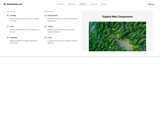
The design aims to provide robust interaction models, including expandable navigation menus for desktop and an accordion-style menu for mobile use, which becomes active based on the screen size. Its structure includes diverse sections like Products, Solutions, Platform, Resources, and Pricing, each further subdivided into various interactive links and image-enhanced descriptions. A salient feature is its responsive state management, which licenses a fluid transition between open and closed states, maintaining the interactive quality critical to enhancing user engagement.