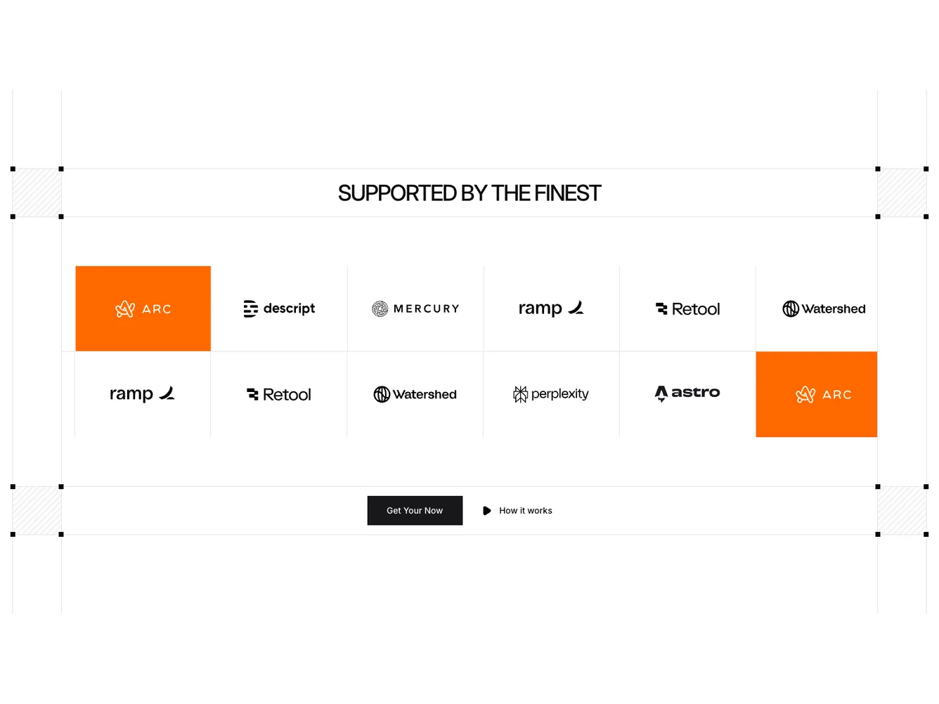
Shadcn UI Logos Block
The Logos11 component is a visually engaging shadcn block designed to elegantly showcase a collection of logos. This component prominently features an auto-scrolling carousel to display logos, accompanied by a compelling header and strategically positioned buttons for interactive elements. With a focus on a clean design and balanced layout, Logos11 provides an intuitive way to highlight supported brands or partners effectively.
Digging deeper, this shadcn ui component comprises two main carousel sections, each running auto-scroll functionality for smooth and continuous movement of logo images. The supporting elements, such as the header and buttons, function cohesively to enhance the user interaction experience. The design is meticulously organized using visually appealing background patterns and shadows, which add depth and perspective to the overall presentation. The flexibility in customizing carousel items, such as conditional background highlighting, ensures that this component can fit a variety of branding requirements.
Dependencies
| Package | Type |
|---|---|
| embla-carousel-auto-scroll | NPM |
| react | NPM |
button @shadcn | Registry |
carousel @shadcn | Registry |
