Login 2 block design & features
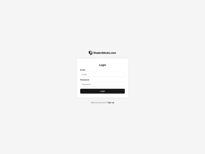
The Login2 component serves as a structured authentication interface, providing a streamlined login experience for users. This component integrates core elements like logo depiction, email and password input fields, and a centralized login button, facilitating user access while maintaining a cohesive design with the rest of the application. The component is easily customizable, with support for modifying texts and logos, making it a versatile option for various applications that require user authentication.
Delving deeper into its layout and design, the Login2 shadcn component is crafted with accessibility and user interaction in mind. It structures the provided content in a vertically aligned format, ensuring both aesthetic appeal and functionality. The component includes customizable props for elements like the heading, logo, and button text, allowing developers to tailor it specifically to their needs. Additionally, a subtle signup suggestion below the main login area provides a seamless transition for new users, enhancing user acquisition strategies.