Feature 66 block design & features
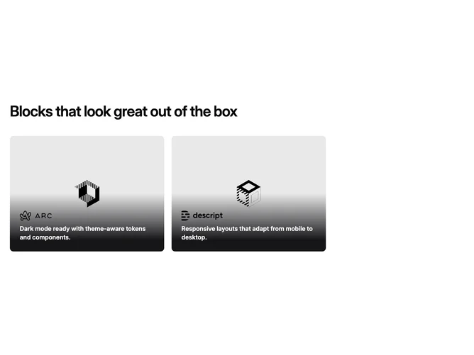
This feature section is built with shadcn/ui patterns and emphasizes two large clickable tiles beneath a restrained heading capped by a readable line length. Each tile fills an aspect-video frame with photographic or illustrative imagery, anchored text and logo treatment pinned along the bottom safe zone rather than centered in the canvas. Links wrap the entire card surface so copy and visuals feel like one control.
Muted card shells and pronounced bottom gradients keep type legible against busy photography. Hover gently scales the imagery inside the clipped rounded frame without shifting layout. Typography uses a strong overlay line for emphasis while the headline above follows standard section scale. Density leans roomy with clear separation between the title block and duet below.
Premium and understated: the interplay of image, gradient band, and small logo wordmark pushes a product-marketing vibe without extra chrome. Complexity is moderate and mostly image-led. You trade on two strong visuals and succinct overlay lines rather than bullet lists.
At small breakpoints the pair stacks in one column full width before returning to side-by-side on medium and up.