Feature 50 block design & features
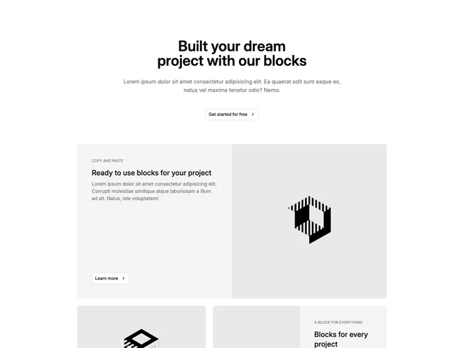
This section built with Shadcn UI opens with a narrow centered column containing a large title, muted supporting paragraph, and an outline call-to-action with a trailing chevron. Below that, three whole-card links use muted panel backgrounds: the first stretches full width and splits text plus a bordered learn-more button against a large image panel, while the lower pair divide the next row with uneven column weight so one tile feels wider than the other. Eyebrow labels in small caps-style muted text introduce each story.
Surfaces stay soft gray with outline controls and photography that snaps to aspect rules per tile. Some tiles tuck a circular icon-only button that eases into view on wide screens to hint at navigation without crowding the card face. Borders separate image and copy regions on split layouts. Overall rhythm alternates between a hero-style full-width promo and two smaller promos.
The pattern reads as one primary promise with three supporting link destinations underneath. It is more complex than a static trio of cards because of the split media panels and asymmetric column spanning. You need three headlines, three short bodies, eyebrow strings, solid imagery, and destination URLs for each linked tile.
Large screens unlock the multi-column track under the intro; smaller screens stack the split panels vertically so images and copy remain readable before the lower tiles follow.