Feature 314 block design & features
Feature314 is an interactive shadcn ui component designed to showcase a collection of articles or projects in a visually appealing manner. It combines both small and large card layouts to present content dynamically, providing an elegant and organized method for users to explore various topics. The component's structure is centered around a primary heading accompanied by an action button, inviting users to engage further with the displayed content. The use of motion effects on images enhances user interaction and provides a modern feel.
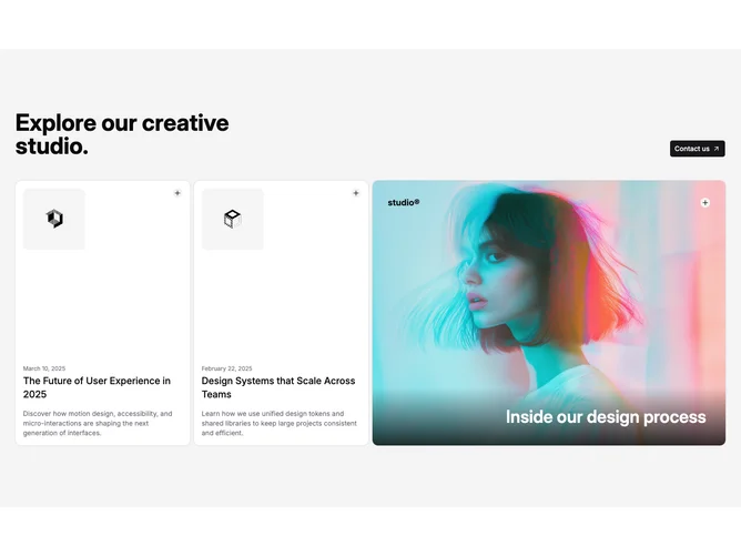
A prominent design feature of the Feature314 shadcn block is its dual-card system that enhances content differentiation. Small cards present snapshots of information with an image, date, title, and summary, offering quick insights into the topic. The large card stands out with an eye-catching image that subtly scales upon interaction, drawing attention to featured content. This strategic layout not only emphasizes key content but also facilitates easy navigation through visual hierarchization. The component uniquely combines motion design and intuitive user experience, setting it apart from more static layouts.