Feature 297 block design & features
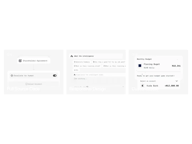
Feature297 is a three-column feature row built with Shadcn UI primitives for structure and spacing. Each column is a tall photographic panel with text layered on top: a small numeric index, a title, and a short line of body copy. The whole column acts as a linked region, so the section reads as three parallel stories rather than one hero and two side items.
Looking at the surface treatment, the photography fills each cell edge to edge while text sits in a high-contrast overlay region. On hover the image scales up slightly inside its frame, which gives motion without refactoring the grid. Typography varies weight between the index, title, and description so hierarchy stays obvious when all three panels are visible at once.
The aesthetic is editorial and image-led: more mood than dense specification copy. Compared with icon-and-bullet feature lists, this block is distinctive because narration rides on photography and restrained type. Complexity is moderate. You need three strong images and short, parallel messages that can share the same layout.
Below three columns on a phone, panels stack in source order so each image still gets full width and the hover zoom remains meaningful on coarse pointers where supported.