Feature 280 block design & features
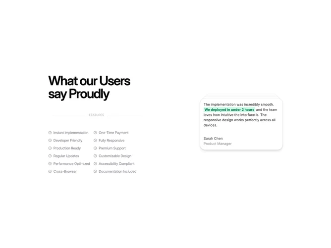
Feature280 is a two-part marketing section built with shadcn/ui, starting centered on small screens then spreading into a side-by-side layout on large viewports. One side leads with a heavy headline, a narrow “features” divider label, and a two-column checklist of capability lines each prefixed with a check glyph. The opposite side hosts a vertically stacked, animated pile of quote cards with names, roles, and short stories.
Light neutrals dominate, with muted dividers and small icons doing most of the decoration. Testimonial copy occasionally wraps key phrases in a bright green highlight chip so skimmers notice outcomes. The stack animates between cards while the checklist stays static, which keeps the section from feeling uniformly flat.
This block reads as more elaborate than a simple icon grid because it mixes list semantics with social proof and motion. Content demand is mixed: you need a dozen-ish checklist strings plus several fully written testimonials. The elaborate piece is motion and layering on the quote deck rather than custom illustration.
On phones the testimonial stack drops below the checklist, preserving reading order while keeping taps away from a cramped split.