Feature 275 block design & features
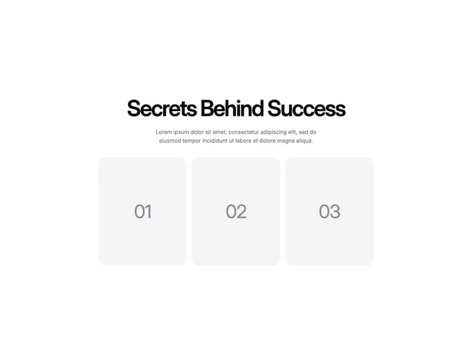
Feature275 is a three-up card section where shadcn/ui layout sensibility frames Aceternity canvas reveals. The top mirrors a stats block: centered display heading and muted paragraph. Each card is a tall rounded rectangle on a muted base. At rest you see an oversized step number. Hovering triggers the canvas animation, darkens or colorizes the interior with configurable palettes, applies a radial vignette, and fades in a title line plus longer body copy.
Default content reads like motivational steps, but the structure suits any trio of sequential ideas. Border pins from the four-corner clip art are omitted here in favor of smooth rounded shells, so the focus stays on the color wash and typographic swap. Motion timing is tied to per-card animation speed props.
Visually this is bold and illustrative, closer to editorial storytelling than a sparse testimonial grid. Complexity is moderate: three cards with hover-only effects mean simpler layout than a four-tile metrics block, but each card still carries custom color arrays and gradient overlays. Provide three headlines, three paragraphs, and consistent numeral styling if you replace the placeholder copy.
The grid starts single column, moves to two columns on medium screens, and completes three columns on large screens while keeping cards centered within a max width container.